
Table of Contents
- What Is Bento Grid Design?
- Core Principles of Bento Grids
- Why Bento Grids Are Trending
- Implementing Bento Grids with CSS Grid
- Common Mistakes to Avoid
- Future Trends in Bento Grid Design
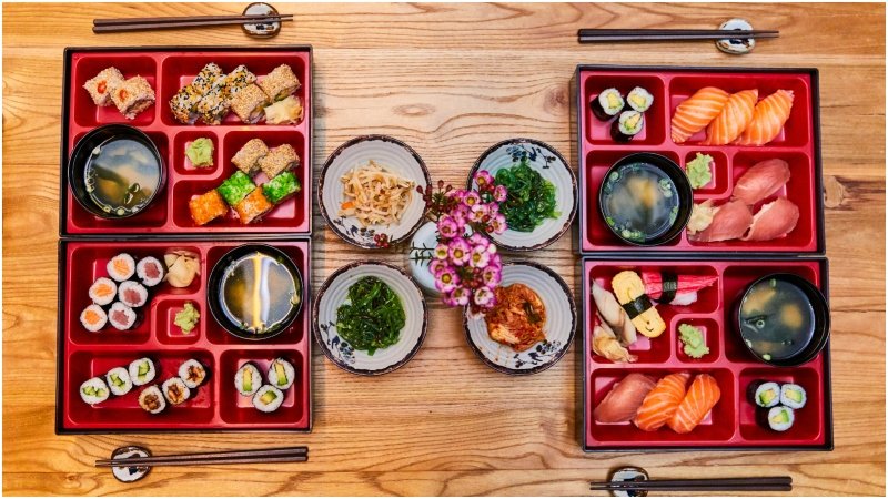
In the ever-evolving landscape of web design, the Bento Grid has emerged as a dominant layout pattern that offers both visual harmony and functional efficiency. Drawing inspiration from the meticulously compartmentalized Japanese lunchbox, this trend organizes content into modular, asymmetric blocks that guide users seamlessly through a website. Explore more live examples by visiting this comprehensive Bento Grid gallery.
Embracing the Bento Grid design approach can transform interfaces into dynamic, user-friendly experiences that stand out among traditional layouts. Its widespread adoption by design-forward brands signals a shift toward modular thinking, where clarity and flexibility are prized above static templates.
Beyond its visual appeal, the Bento Grid’s structured compartmentalization addresses one of the biggest challenges in modern web design: balancing an engaging presentation with effective information management. By breaking content into sections of varying size and prominence, designers can establish an intuitive hierarchy that helps users quickly scan and interact with content.
This pattern’s increasing prevalence across major platforms, such as Apple’s product pages and Notion’s dashboards, underscores its growing influence and adaptability in both consumer and enterprise applications.
What Is Bento Grid Design?
Bento Grid Design structures websites into clear, asymmetric blocks of content, leveraging module size and placement to establish hierarchy. Unlike uniform grid systems, this approach supports a scannable, visually engaging experience by assigning larger areas to critical calls-to-action or images and smaller sections to supporting details. Companies at the forefront of digital design are embracing Bento Grids to present services, product features, and analytics in a way that feels both modern and intuitive for users.
Core Principles of Bento Grids
- Hierarchy through Size:Important elements are given more visual real estate, drawing immediate user attention.
- Visual Rhythm:Alternating block sizes and shapes create movement and interest, preventing layouts from feeling monotonous.
- Consistent Spacing:Uniform gaps between elements are critical for keeping the interface organized and easy to read.
- Rounded Corners: Soft edge styling provides a contemporary, approachable feel that resonates with modern user expectations.
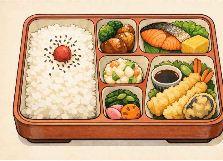
Adhering to these principles allows designers to construct cohesive, attractive Bento Grids that not only direct attention but also present information in digestible, user-friendly formats. For a more in-depth perspective on grid-based design strategies, Smashing Magazine’s CSS Grid article provides an excellent overview.
Why Bento Grids Are Trending
- Enhanced User Engagement:Research shows Bento Grids can boost page dwell time by 47 percent and click-through rates by 38 percent. Their engaging layouts help users locate relevant content efficiently.
- Effective Information Management:Modular blocks segment information, making it easier for users to digest complex details without cognitive overload. Each compartment can be scanned independently, building confidence in navigation.
- Mobile Responsiveness:The flexibility of Bento Grids translates well to smaller screens. Modular design ensures layouts can stack and respond gracefully, maintaining usability on tablets and smartphones.
Bento Grids perfectly align with the growing demand for interfaces that blend beauty and utility, providing a fresh look for brands aiming to establish a strong digital presence. As highlighted in Senorit’s coverage of Bento Grid design trends, the embrace of modular grids signals their mainstream acceptance.
Implementing Bento Grids with CSS Grid
Modern CSS Grid techniques make implementing Bento Grids straightforward. Designers typically employ a four-column layout, using span classes to control the size and placement of each block. For example, a wide hero image might span two columns and two rows, while smaller modules fill the remaining spaces. This structure empowers designers to build layouts that are complex yet manageable, and adjust quickly to varying screen sizes.
With the right use of CSS properties such as grid-template-columns and gap, designers can iterate layouts while maintaining alignment and consistency across devices. Responsive adjustments using @media queries ensure each grid adapts to different screen widths, providing a cohesive user experience regardless of device.
Common Mistakes to Avoid
- Overcrowding:Packing too many elements into each grid block can diminish clarity, overwhelming users, and making navigation tricky.
- Lack of Hierarchy:Neglecting size-based cues causes users to struggle with prioritizing content, leading to frustration or missed opportunities for engagement.
- Inconsistent Styles:Using varied corner radii, colors, or shadow effects across blocks interrupts the unified design and can erode trust in the brand’s aesthetic.
By being mindful of these issues and striving for balance, Bento Grids can deliver on their promise of intuitive, visually compelling interfaces.
Future Trends in Bento Grid Design
- Animated Grids:Incorporating movement, such as subtle hover or load animations, can introduce an extra layer of engagement and delight.
- AI-Generated Layouts:Leveraging artificial intelligence to suggest or auto-generate Bento Grid layouts based on user behavior will enable more personalized interfaces in the future.
- Personalizable Blocks:Empowering users to move or resize modules encourages a sense of ownership and makes interfaces even more interactive and relevant.
As Bento Grid design continues to evolve, expect its modular elegance and adaptability to become foundational in digital product development. Staying ahead of these trends enables companies and designers to deliver websites that are consistently fresh, practical, and visually distinctive.


